


Company:
Staking Rewards
Role:
Staff Product Designer
Date:
Jun 2025
Business Goals:
Leads, Visibility & Revenue
Turned a discovery tool
into a revenue engine.
Overview
The priorities of these project was to strengthen one of the three main revenue streams of the business: Verified Staking Providers (VSPs).
Unlike retail users, investors deploying large amounts of capital in the DeFi ecosystem do not choose providers based on reward levels. Their decisions are driven by security, trust, risk exposure, and capital preservation. This required a clear shift in messaging: moving away from “yield” and toward quality, curation, and judgment.
The homepage, as the main entry point to the product, played a critical role in communicating that value.
KPI
Increase qualified leads from capital allocators to Verified Staking Providers (VSPs), the company's highest-margin revenue stream.
Data
Sample from Sept 2024 - Mar 2025
Note: This is not all the information we evaluate but the one I can show.
Problem & Insights
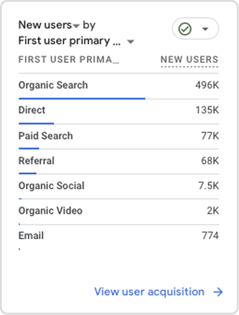
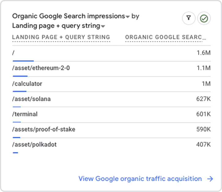
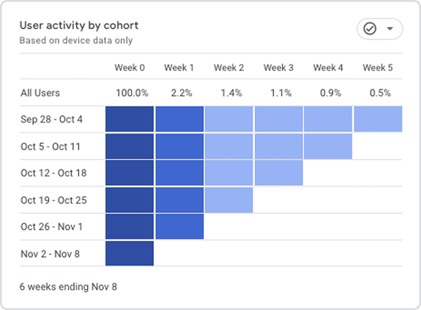
Problem: This limited access to qualitative interviews, so the analysis was based on behavioral evidence: analytics, usage patterns, and internal metrics. Instead of speculating, we observed how users actually interacted with the product.
Insight1: The highest-quality organic traffic was landing directly on the staking calculator, a page isolated from the rest of the site but effective as an entry point from search.
Insight 2: This type of user used Staking Rewards as an information and discovery layer, but closed contracts and transactions outside the platform.
Insight 3: Users arrive with intent via search, consume value through specific tools or asset pages, make a decision, and move on — retention is low because the job is done.
Design Principles
Before designing, we defined a set of clear principles that guided all decisions:
Prioritize user intent over corporate storytelling
Reduce cognitive friction in decision-making
Use data and curation as trust mechanisms, not marketing
Solution
We restructured the homepage around the insight: the calculator was already the real entry point — we just made the architecture match the behavior. Three key moves:
Calculator as hero: Moved from buried subpage to homepage centerpiece
Curated Top 5: Replaced an open provider list with a scored, ranked selection with explicit recommendation
Simplified IA: Stripped the homepage to reflect only the three core business areas, removing narrative sections that analytics showed users skipped
What we considered and rejected
An early direction explored a personalized dashboard for returning allocators. We killed it because data showed these users had single-session intent — they research, decide, and leave. Investing in retention mechanics would have optimized for a behavior that didn't exist.
Results vs objective
Within the first two weeks, qualified leads from capital allocators nearly doubled vs. the previous 6-month average. But the unexpected outcome was bigger: large staking providers began reaching out proactively, asking to pay for placement in the Top 5. This opened an entirely new revenue stream that wasn't part of the original brief.
1. Our best landing page might already exist
The calculator was outperforming the homepage and nobody had noticed.
Lesson: audit what's already working before designing something new.
2. Curation beats comparison in high-stakes decisions
When capital is significant, users don't want 50 options. They want a shortlist they can trust. The Top 5 with explicit scoring generated more engagement than the full provider directory ever did.
3. Design can open revenue streams
The Top 5 wasn't designed as a monetization feature. But by making curation visible and valuable, it became something providers wanted to pay for.